
Welcome to the second part of our blog series on the combination of color theories for brand identity. In today's world, where consumers are bombarded with a plethora of brands, a distinctive visual identity is crucial to stand out from the competition. A well-crafted color palette can be an effective tool to achieve this. In our previous blog, we discussed the importance of color combinations for brand identity and explored some of the popular color theories that can help brands create a cohesive and effective color palette.
In this second part of our series, we will dive deeper into the significance of eight more color combinations that can help your brand establish a strong and memorable visual identity.
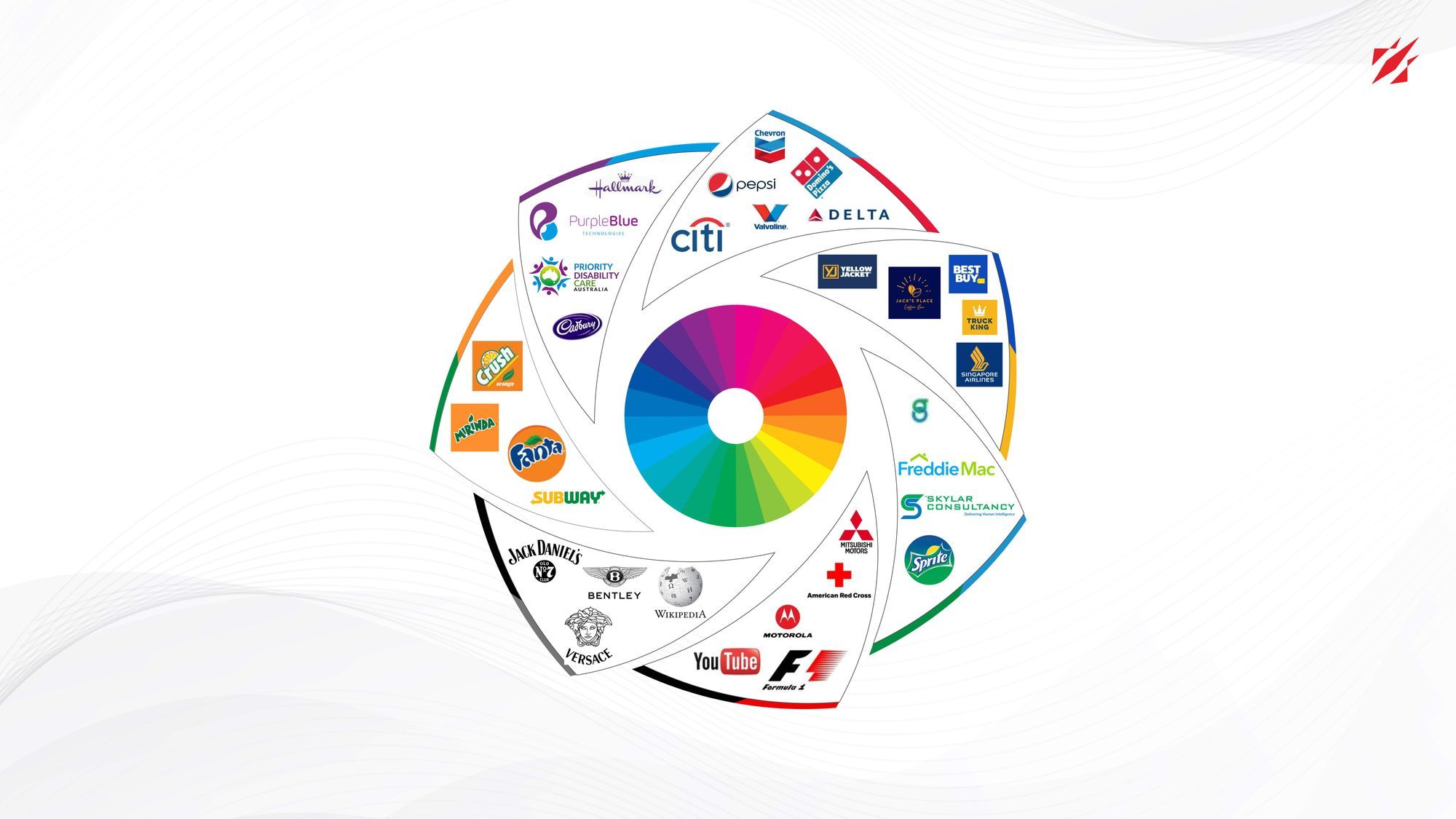
To know more about Color Theory, read:
Color Theory: The Role of Colors In Brand Identity Designs
Let's explore the exciting possibilities that color combinations can offer for your brand.
- Purple and Yellow
In the world of branding and design, the fusion of purple and yellow is an unusual yet powerful chromatic duo. Purple is often associated with luxury, creativity, and sophistication, while yellow represents optimism, cheerfulness, and warmth. Together, these colors create a unique and bold brand image that can stand out from the competition.
In marketing and advertising, the purple and yellow color combination can create a sense of playfulness and excitement. Yellow is known to capture attention and evoke feelings of happiness and energy, making it a popular color choice in advertising. Meanwhile, purple is often associated with creativity and innovation, making it a great choice for tech and software companies. Together, these colors create a sense of joy and creativity that can be appealing to consumers. - Gold and Burgundy
In the realm of branding and design, the melding of gold and burgundy hues holds a deep-seated significance, especially in domains that exude opulence, style, and allure - think luxury, fashion, and beauty industries.Gold is often associated with wealth, luxury, and sophistication, while burgundy is associated with elegance, power, and strength. Together, these colors create a rich, opulent brand image that communicates both exclusivity and refinement.
In marketing and advertising, the gold and burgundy color combination can be used to create a sense of luxury and exclusivity. Gold is a color that is often associated with premium quality, while burgundy conveys a sense of richness and depth. This color combination is commonly used in advertisements for high-end products and services. - Pink and Orange
Pink and orange, when combined, hold great significance in the world of branding and design, especially in the domains of food and beverage, entertainment, and health and wellness. Pink is often associated with femininity, sweetness, and youthfulness, while orange is associated with energy, excitement, and enthusiasm. Together, these colors create a playful and vibrant brand image that appeals to a younger demographic.
In marketing and advertising, the pink and orange color combination can be used to create a sense of enthusiasm and excitement. Pink is a color that is often associated with joy and happiness, while orange is associated with energy and vitality. This color combination is commonly used in promotions for products and services that are meant to be fun and enjoyable. The pink and orange color combination can also be used to create a sense of warmth and approachability. - Brown and Blue
Brown and blue, when paired together, can evoke a sense of reliability and stability, making them a potent choice for branding and design. Brown is often associated with warmth, stability, and reliability, while blue is commonly linked to trust, intelligence, and professionalism. When used together, these colors can create a sense of dependability and credibility that can help build trust and loyalty with customers.
In the context of marketing and advertising by leveraging the associations of these colors, companies can communicate a sense of authority, expertise, and security, which can be particularly appealing to customers looking for reliable and trustworthy solutions. Additionally, this color combination can be used to convey a sense of sophistication and elegance. - White and Red
When it comes to branding and design, the combination of white and red is a potent duo that carries a significant weight. The pairing of white and red is commonly associated with brands that want to convey a sense of energy, excitement, and passion. The contrast between the two colors creates a visual impact that is memorable and attention-grabbing. Additionally, white is often associated with purity, cleanliness, and simplicity, while red is linked with power, strength, and urgency. When used together, these colors create a powerful message that can resonate with consumers and make a lasting impression.
In marketing and advertising, the white and red color combination is often used to evoke emotions such as passion, desire, and excitement. This combination can be used to create a sense of urgency or to encourage action. Additionally, white can be used to convey a sense of purity and simplicity. Overall, the white and red color combination is a powerful tool that can be used to create a brand identity that is memorable, impactful, and emotionally engaging. - Green and Red
The fusion of green and red is a frequently sought-after color palette in the world of branding and design, owing to its ability to produce a visually arresting contrast that captures the attention of the beholder. The use of green often conveys a sense of growth, renewal, and nature, while red is associated with passion, energy, and excitement. Together, they create a dynamic combination that can be used to communicate a brand's message effectively.
In marketing and advertising, the green and red color combination can be used strategically to create a sense of urgency and drive sales. Red is often associated with sales and discounts, while green is associated with savings and value. By using these colors in conjunction with promotions and limited-time offers, companies can create a sense of excitement and urgency that encourages consumers to make a purchase. Additionally, the use of green and red in advertising can be an effective way to stand out from competitors and make a lasting impression on potential customers. - Pink and Grey
The delightful duo of pink and grey has become a beloved color combination that's frequently employed in the realm of branding and design. The contrast between the softness of pink and the neutrality of grey creates a sense of balance and sophistication. Pink is often associated with femininity, love, and affection, while grey is associated with elegance, stability, and professionalism.
In the context of marketing and advertising, pink and grey are also used to convey specific messages. Grey, on the other hand, is associated with technology and innovation and is commonly used in branding for companies in the tech industry. When used together, these colors can create a sense of compassion and intelligence, which is particularly effective in marketing campaigns that aim to connect with customers on an emotional level. - Grey and Blue
The amalgamation of grey and blue hues has gained widespread popularity in branding and design owing to its sleek and refined appearance that exudes an air of professionalism. The color grey is associated with neutrality, stability, and balance, while blue represents trust, loyalty, and intelligence. Together, they create a calming and trustworthy feel. The combination is often used in logos, website design, and advertising campaigns to convey a sense of reliability and competence.
In marketing and advertising, the grey and blue color combination can be highly effective in creating a strong brand identity. This color combination has a broad appeal and is associated with trustworthiness, dependability, and quality. In a sea of vibrant and colorful ads, a grey and blue design can stand out and capture the attention of the target audience. By using this color combination, brands can create a lasting impression on their audience and establish themselves as leaders in their industry.

In conclusion, combining different color theories can be a powerful tool for creating a strong and cohesive brand identity. By leveraging the psychology and cultural associations behind different colors, brands can create a visual language that resonates with their target audience and conveys the right message.
Understanding the science behind color theory, such as color harmony and contrast, can help brands create a memorable and effective color palette that reinforces their brand values and personality. Furthermore, brands must remain mindful of cultural and regional differences in color symbolism when creating a global brand identity. By combining color theories and utilizing them effectively, brands can create a distinctive visual identity that sets them apart from the competition and establishes a lasting connection with their customers.
Also read: Combination Of Color Theories: Synergizing To Create A Memorable Brand (Part I)