
Color is a vital component in building a powerful brand identity as it communicates the intended message to the audience. The appropriate color scheme can elicit specific emotions and associations, resulting in a remarkable brand image that connects with customers.
For decades, successful brands such as Coca-Cola's bold and vibrant red or Apple's minimalist black and white have effectively utilized colors to their advantage. In this blog, we will discuss the significance of color combinations for brand identity, delve into the psychology of color choices, and provide tips to create a consistent and compelling color palette for your brand.
Color is one of the most powerful tools in a brand's visual identity toolkit. It can influence consumer behavior, create a sense of brand personality, and help differentiate a brand from its competitors. But choosing the right colors for your brand is not just a matter of personal preference or aesthetics. It requires a deep understanding of color theory, cultural associations, and target audience demographics.

We introduce you to the top two considerations that you should have before choosing your brand color palette:
- Understanding the psychology of colors - Different colors can evoke different emotions and attitudes and can influence how people perceive your brand. For example, blue is often associated with trust, dependability, and professionalism, which is why it is commonly used by financial and healthcare companies.
On the other hand, red is often associated with passion, energy, and excitement, which is why it is a popular choice for food and beverage brands. By understanding the psychology of color, you can choose colors that align with your brand's values and personality, and that resonate with your target audience. - Colors and their respective cultural associations - Colors can have different meanings and connotations in different parts of the world, and what may be perceived as positive or negative in one culture may be the opposite in another. For example, in Western cultures, white is often associated with purity, cleanliness, and innocence, while in some Eastern cultures, it is associated with death and mourning.
Similarly, red is considered lucky and auspicious in many Asian cultures, while in some Western cultures, it is associated with danger and warning. When choosing your brand's colors, it's important to research the cultural associations of each color and ensure that they align with your brand's values and messaging.
Once you've chosen your brand's color palette, it's important to use it consistently across all your branding materials, from your logo to your website to your packaging. Consistency helps create a strong brand identity and makes it easier for consumers to recognize and remember your brand. It's also important to consider the contrast and balance of your colors, as too many colors or colors that clash can create a chaotic or unprofessional impression.
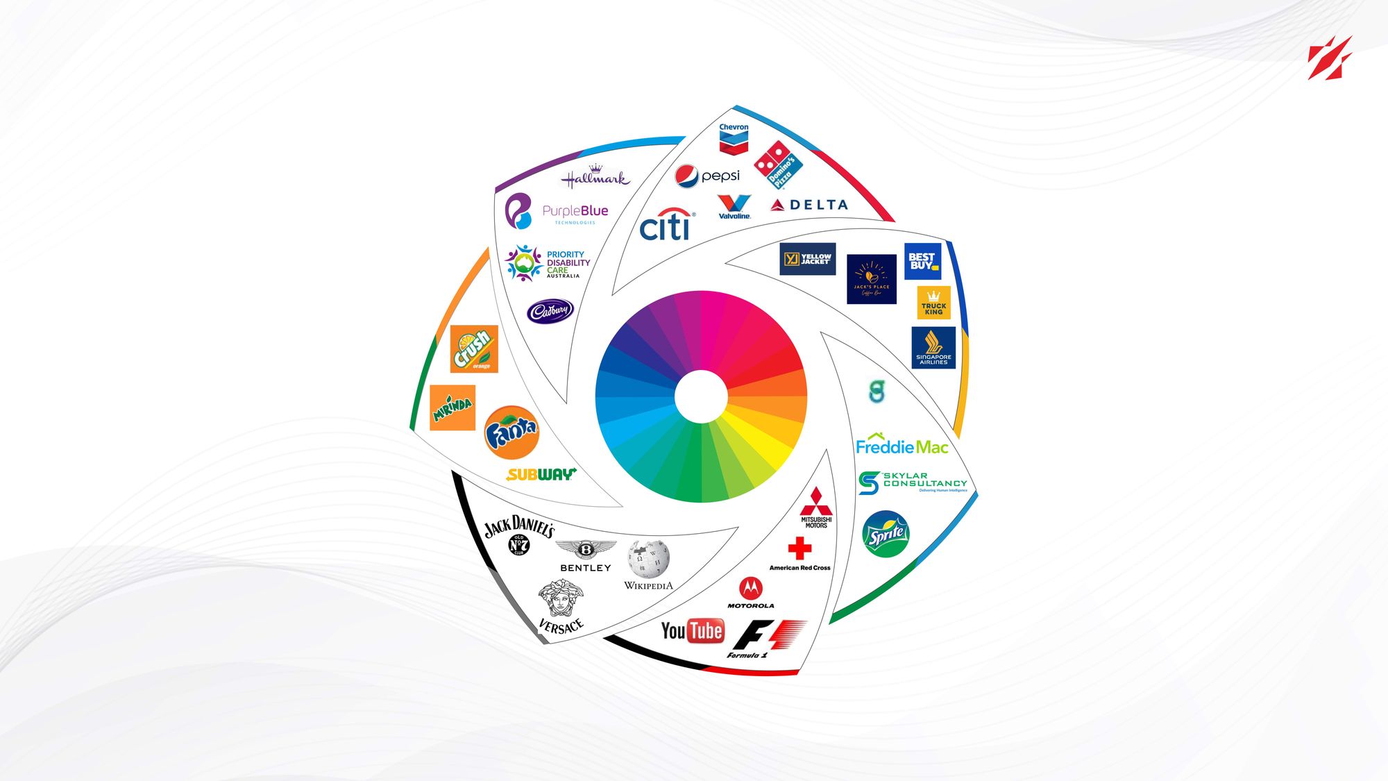
Here are some of the color combinations and their significance with respect to branding, design, marketing, and advertising. In Part I of this blog let’s dive into seven of these fifteen color combinations.
- Blue and Red
Blue and red, when used in combination, hold great significance not only in branding, design, marketing, and advertising but also in the realm of politics, where they are often associated with opposing ideologies. In branding and design, blue is associated with trust and reliability, while red represents passion and excitement. When combined, these colors create a dynamic and balanced brand image that communicates both stability and innovation.
In marketing and advertising, the blue and red color combination can create a sense of urgency and importance. Red stimulates appetite and creates a sense of urgency, while blue, on the other hand, communicates trust and dependability. Together, these colors create a powerful message that can influence consumer behaviour and create brand recognition. - Blue and Yellow
In branding and design, the pairing of blue and yellow has become a beloved color palette, capturing attention with its playful yet professional vibe. Blue is often associated with trust, security, and professionalism, while yellow conveys optimism, energy, and warmth. Together, these colors create a sense of balance and harmony that can be used to create a brand image that is both professional and approachable.
In marketing and advertising, the blue and yellow color combination can be used to create a sense of optimism and positivity. Yellow is known to stimulate positive emotions and create a sense of happiness. Meanwhile, blue can be used to communicate trust and dependability, making it a popular choice in the advertising of financial products and services. Together, these colors can create a powerful message that can influence consumer behavior and create brand recognition. - Blue and Green
The hues of blue and green have long been linked to the natural world and its conservation, and their fusion holds a profound significance in the realms of branding and design. Blue is commonly used to represent trust, reliability, and professionalism, while green represents growth, health, and harmony. Together, these colors can create a brand image that communicates a sense of environmental responsibility and sustainability.
In marketing and advertising, the blue and green color combination can be used to create a sense of calm and tranquillity. Blue is known for its calming and soothing effects, while green is associated with nature and the outdoors. Together, these colors can create a sense of relaxation and peace. - Black and Red
Black and red is a highly sought-after color palette in the world of branding and design as it evokes a striking and elegant visual impression. Black is often associated with luxury, elegance, and exclusivity, while red is associated with passion, energy, and excitement. Together, these colors create a striking and dynamic brand identity that communicates both sophistication and excitement.
In marketing and advertising, the black and red color combination can create a sense of urgency, excitement, and exclusivity. Red stimulates the senses and creates a sense of urgency, making it an excellent choice for sales and promotions. Meanwhile, black is often used to communicate luxury and exclusivity, making it a popular choice for high-end products and services. Together, these colors create a sense of sophistication and exclusivity, making the products and services more desirable to consumers. - Grey and Black
In the world of branding and design, the union of grey and black is an ageless and timeless color scheme. Grey represents neutrality, balance, and sophistication, while black connotes power, elegance, and authority. Together, these colors create a sleek and timeless brand image that communicates professionalism and seriousness.
In marketing and advertising, the grey and black color combination can create a sense of sophistication and exclusivity. Grey and black can also convey a sense of mystery and intrigue, making it a popular color choice for beauty and fragrance advertisements. The combination of grey and black creates a sleek and sophisticated brand image that appeals to discerning customers who appreciate quality and exclusivity. - Orange and Green
When it comes to branding and design, the marriage of orange and green hues holds a profound significance. Orange represents warmth, friendliness, and enthusiasm, while green is associated with growth, harmony, and balance. Together, these colors create a brand image that communicates a sense of positivity, energy, and growth.
In marketing and advertising, the combination of orange and green can create a sense of excitement and novelty. Orange is a color that stimulates the senses and creates a feeling of urgency. Green, on the other hand, is associated with health and wellness. Together, these colors create a powerful message that can influence consumer behavior and create brand recognition. - Blue and Purple
Blue and purple combine to form a sophisticated and meaningful color scheme that holds significant value in branding, design, marketing, and advertising. Blue is a color that symbolizes trust, reliability, and professionalism, while purple is associated with creativity, luxury, and sophistication. Together, these colors create a brand image that is both professional and elegant, making it a popular choice for high-end products and services.
In marketing and advertising, blue and purple can be used to create a sense of luxury and exclusivity. The blue and purple color scheme conveys a sense of elegance, sophistication, and exclusivity, which is desirable for luxury products and services. When used correctly, this color combination can create a strong brand image that resonates with consumers and builds brand recognition.
In conclusion, a well-crafted color palette is an essential component of any brand's identity, and combining different color theories can be a powerful tool to achieve this. It allows brands to create a unique visual identity that resonates with their target audience and communicates their values and personality.
However, the art of color combination is vast, and there are many more exciting possibilities to explore.
To learn about 8 more color combinations for your brand identity, be sure to follow our LinkedIn for reading Part II of our blog series. By continuously refining and evolving your brand's color palette, you can establish a strong and memorable visual identity that connects with your customers and helps you achieve your business goals.