Color plays a crucial role in shaping a brand's identity. From the shades of blue used by tech giant IBM to the iconic golden arches of McDonald's, the colors selected for a brand's logo and marketing materials can significantly impact how consumers perceive and remember the brand. In this blog, we will explore the various color theories and how they can be used to create a strong and recognizable brand identity. Whether you're a seasoned graphic designer or just starting, this comprehensive guide will give you the knowledge to make informed decisions about color in your brand designs.
"What makes a color so valuable?"
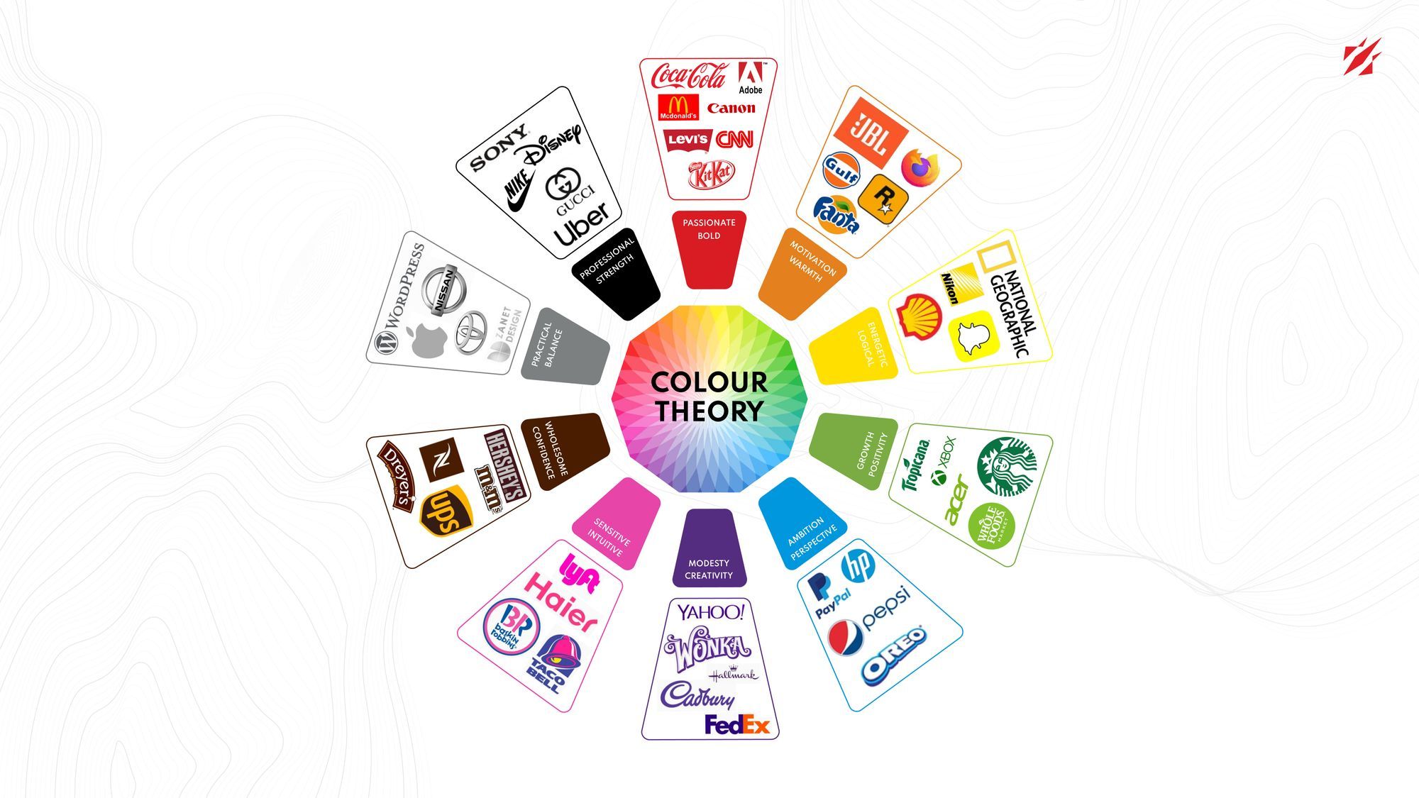
To grasp this concept, we must explore color theory and comprehend the lasting impact colors have on the human mind and, as a result, branding.
Personas: Establishing the cornerstone of a well-loved brand
It's common for a child to imagine a stuffed animal, like a teddy bear, as a person with emotions, feelings, and personality traits by giving it a name. Marketing and design teams do the same with products to be marketed. Personifying inanimate objects is a crucial aspect of defining a brand's persona in branding, which refers to the brand's unique characteristics.
Defining a brand's perspective, tone, and voice provides a comprehensive understanding of the brand's personality. Five distinct dimensions or traits usually characterize this persona.
- Authenticity: Does the brand have a down-to-earth personality? Is it truthful, wholesome, and cheerful? An example of an authentic brand is the Michelin Man.
- Adventure: Is the brand daring and imaginative? Does it embrace innovation? A classic example of an adventurous brand is Disney.
- Reliability: Is the brand trustworthy and successful? Does it exude intelligence? An example of a reliable brand is Allstate.
- Elegance: Does the brand have charm and luxury? Is it prestigious? An example of an elegant brand is Rolex.
- Durability: Do the brand exhibit toughness and a rugged appearance? Is it associated with the outdoors? An example of a durable brand is Brawny Paper Towels.
For instance, research has demonstrated that utilizing color can boost brand recognition by a whopping 80%. Let us look at examples.
If we examine a household name like McDonald's, we can observe that the "Golden Arches" are designed to trigger a sensory chain reaction in the right context quickly. It is almost impossible not to conjure up the image of the well-known McDonald's red fries container, which then evokes the scent of hot, salty fries. This Pavlovian response, which stimulates the smell or taste of French fries, is intended to inspire a visit to McDonald's.
Also Read:
6 Simple Steps For a Successful Brand-Building Process
Incorporating Color into Branding

Color has been a vital part of human life since the beginning of time. People have an innate response to colors, which can indicate danger (such as the discoloration of spoiled food) or safety (such as the recognizable colors of a tribe's flag). Color remains a significant source of meaningful information.
The meaning of colors is derived through two primary methods: natural association and psychological/cultural association.
- Natural association - It refers to the innate association of colors with the natural world, such as the colors of the ocean, sky, and trees, and their corresponding biological attributes, like the ripeness of fruit or the potential danger of weather conditions based on the color of the sky. It also encompasses biological responses to the wavelength or frequency of color, like the impact of blue light emitted by some electronics on circadian rhythms.
- Psychological/Cultural association - It refers to the meaning assigned to colors based on cultural and religious upbringing. Color theory assists in comprehending how cultural factors, gender, religion, and market trends shape our interpretation of color, thus guaranteeing that the brand's colors align with the message intended for the target audience. When consulting with clients about branding, we consider color theory from a natural and cultural perspective.
For instance, consider the color blue. It naturally represents water or the sky. It is culturally associated with masculinity in the US, while it is regarded as a feminine color in China. This showcases how the meanings attached to color can vary based on geographic or cultural factors, highlighting the importance of comprehending the context in which a company's brand and materials will be presented. This is particularly crucial for global brands that must select colors suitable for diverse markets without causing any cultural misunderstandings. Hence, conducting focus groups and consumer testing is vital in introducing a product globally or launching a global website version.
Also Read:
Event Branding, Brand Design strategy, and marketing videos for corporate companies
Color meaning and associations

Color is capable of eliciting feelings and emotions, including in the context of selecting colors for business. The appropriate choice of colors for marketing can set your brand apart or blend it in with others. By deliberately utilizing colors in marketing, you can influence your audience's perception of your brand, aligning it with your desired image. Hence, knowledge of color psychology is a valuable tool in marketing, enabling you to present your brand as you envision.
Colors can evoke various emotions and connotations, and the significance of color in a logo can vary based on the brand's context. Here are some of the standard interpretations and associations of colors in logos:
- Red: A bold and eye-catching color that represents energy, passion, and excitement but can also suggest danger.
- Blue: A calming and dependable color that symbolizes stability, security, and loyalty. Often linked to technology and communication.
- Green: A tranquil and organic color that exemplifies growth, health, and balance. Usually associated with eco-friendly and sustainable companies.
- Yellow: A bright and positive color that represents happiness, creativity, and caution. Commonly used in warning signs.
- Purple: A regal and enigmatic color that symbolizes luxury, elegance, and sophistication. Also related to creativity and spirituality.
- Orange: A warm and inviting color that represents excitement, creativity, and affordability.
- Black: An intense and refined color that represents elegance, mystery, and authority. Often used to convey luxury and high-end products.
- White: A crisp and neutral color that represents purity, innocence, and simplicity. Usually related to minimalism and modern design.
Digitizing Your Company's Color Scheme

Translating colors from print to digital and vice versa is not always accurate. When we receive a color palette from a client mostly used for print materials, we often find that it only sometimes looks good on the web. For example, a metallic color like gold may look stunning in print but lose its shine and appear dull on the web.
"Not all clients need or desire a comprehensive analysis of their branding. In some cases, we utilize existing brand elements and enhance them. One approach is to add more color options to a client's primary palette. Many clients prefer incremental changes to gradually evolve their brand over time, and color can be introduced in a way that is manageable to their audience.
However, there are times when a radical change can be beneficial. Brands that need a fresh start in the market can benefit from a brand overhaul. This can generate excitement and reach new audiences (e.g., a brand that shifts from snack foods to healthy options). Color also plays a crucial role in sites with a lot of content. For instance, it can establish content classification by associating colors with specific content types (e.g., video, article, case study, etc.).
Completing the Cycle: Why is Color So Valuable?
This embodies a fundamental principle of branding: when appropriately executed, branding creates a visceral experience for the customer that appeals to emotions, transcending logic. We have seen that color plays a crucial role in achieving this impact.
Proper utilization of color can ensure consistency across digital touchpoints with the overall brand and convey a sense of support and significance to all target groups of the brand.
Follow our LinkedIn for the next article on how the combination of color theories helps in brand identity.