
Reimagining Qik Office for the Future of Work.

CUSTOMER STORY
We revamped Qik Office’s website and improved the application UX to make a powerful AI office platform feel clearer, faster, and easier to trust. Qik Office positions itself as a unified work environment with AI minutes, action to-dos, office rooms, scheduler, chat, notes, files, recordings, transcriptions, and whiteboards, so the experience needed to communicate a lot without overwhelming the user.
Client
Qik Office
Industry
Location

01
Client Requirement
To create a modern and intuitive digital experience that clearly presents Qik Office as an AI office app for meetings, rooms, scheduling, collaboration, and organized work data across online, in-person, and hybrid environments.
Client Brief
Qik Office needed its website and product experience to better reflect the scale of a platform that combines AI minutes, action items, rooms, scheduler, chat, notes, files, and collaborative work tools in one ecosystem. The brief was to simplify the overall experience, strengthen the visual language, and improve product UI/UX so users could understand the platform faster and navigate key workflows with greater ease.
Outcomes
The redesign improved not only the website narrative but also the product experience, creating a clearer and more usable journey across meetings, scheduling, rooms, and follow-up actions. This helped Qik Office present itself more convincingly as a unified AI office platform rather than a collection of separate features.
02
Our Role
We led the website revamp and improved the product UI/UX for Qik Office, covering UX audit, information architecture, UI refinement, usability improvements, and conversion-focused experience design.


UI/UX Design
Customer Experience Design - UX/UI


Website Design and Development
CX - Customer Experience for the Application
03
Problem Analysis

Qik Office offers a broad ecosystem of meetings, rooms, scheduling, collaboration, and AI-organized work data, which made the overall experience feel feature-heavy without clearer structure.
Both the website and the product interface needed stronger hierarchy so users could understand key workflows and move through them with less friction.
The platform needed to be positioned and designed as more than a meeting tool — as a full AI office app that supports work across online, in-person, and hybrid environments.
04
Solution
Crafted a clearer cross-platform experience by simplifying the information architecture across web and product touchpoints.
Elevated the product UI/UX with more intuitive workflows, better usability, and a more cohesive interaction model.
Sharpened the brand and product narrative to position Qik Office as a future-ready AI office ecosystem.
Learnings
01
With user journey evolving everyday, mastering micro-moments is highly necessary.

02
Incorporating images that represented the brand's purpose, like enhancing human interaction elements enhances user involvement.

03
Custom icons create uniformity and consistency across the application.

05
Our Approach & Creations
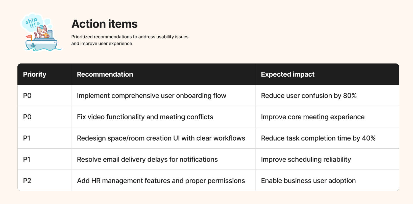
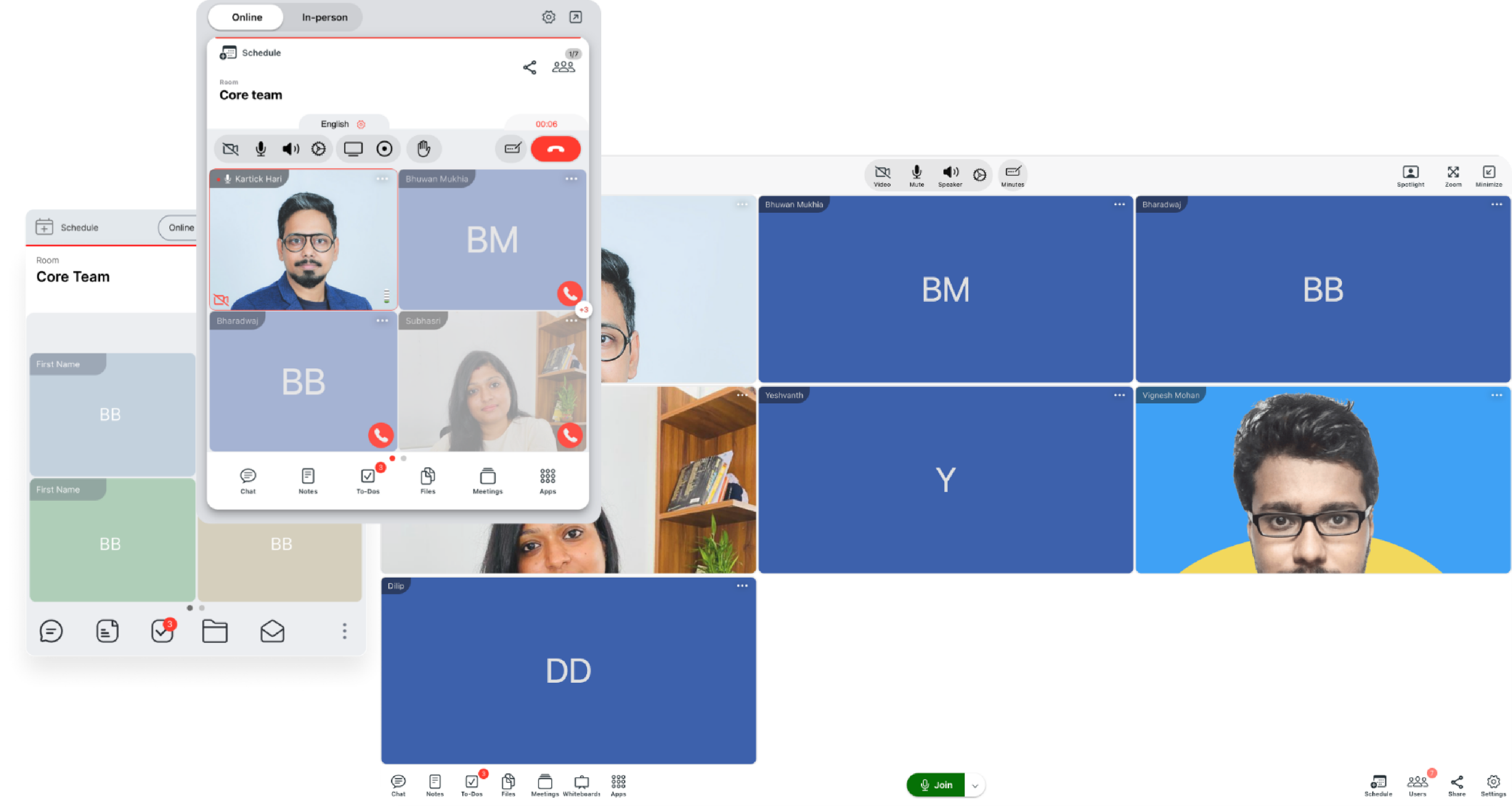
We reworked the Qik Office product experience end to end, combining UX analysis, UI refinement, feature restructuring, performance optimization, and stronger system design to deliver a more intuitive, responsive, and scalable application.
UX Analysis
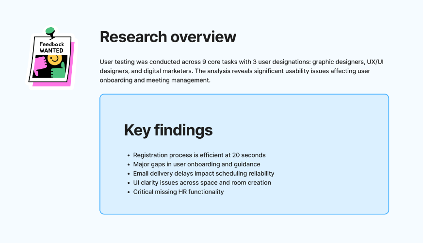
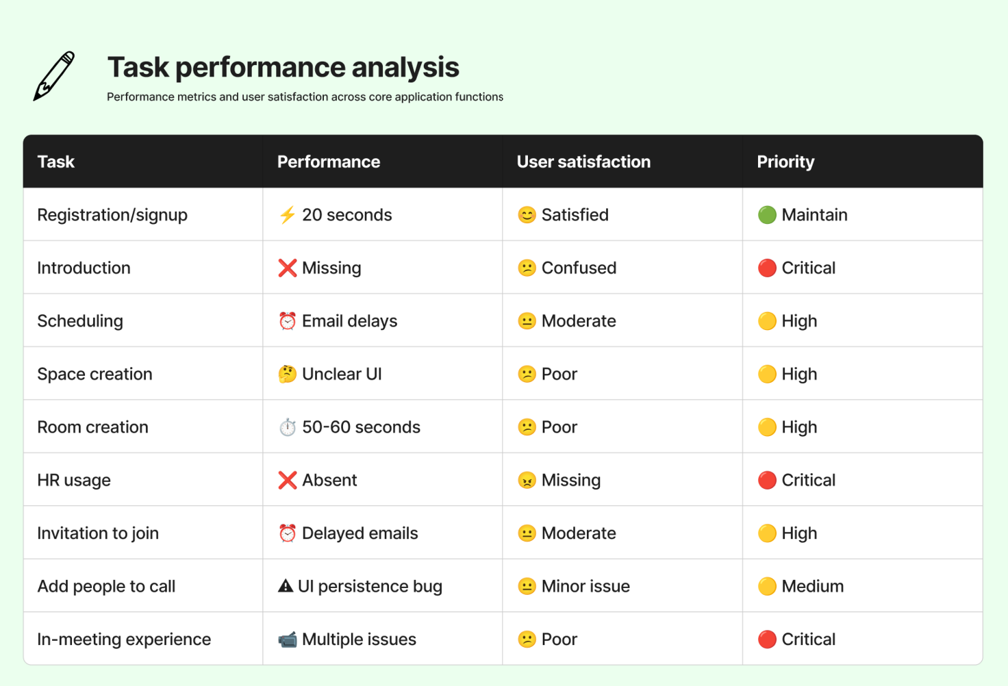
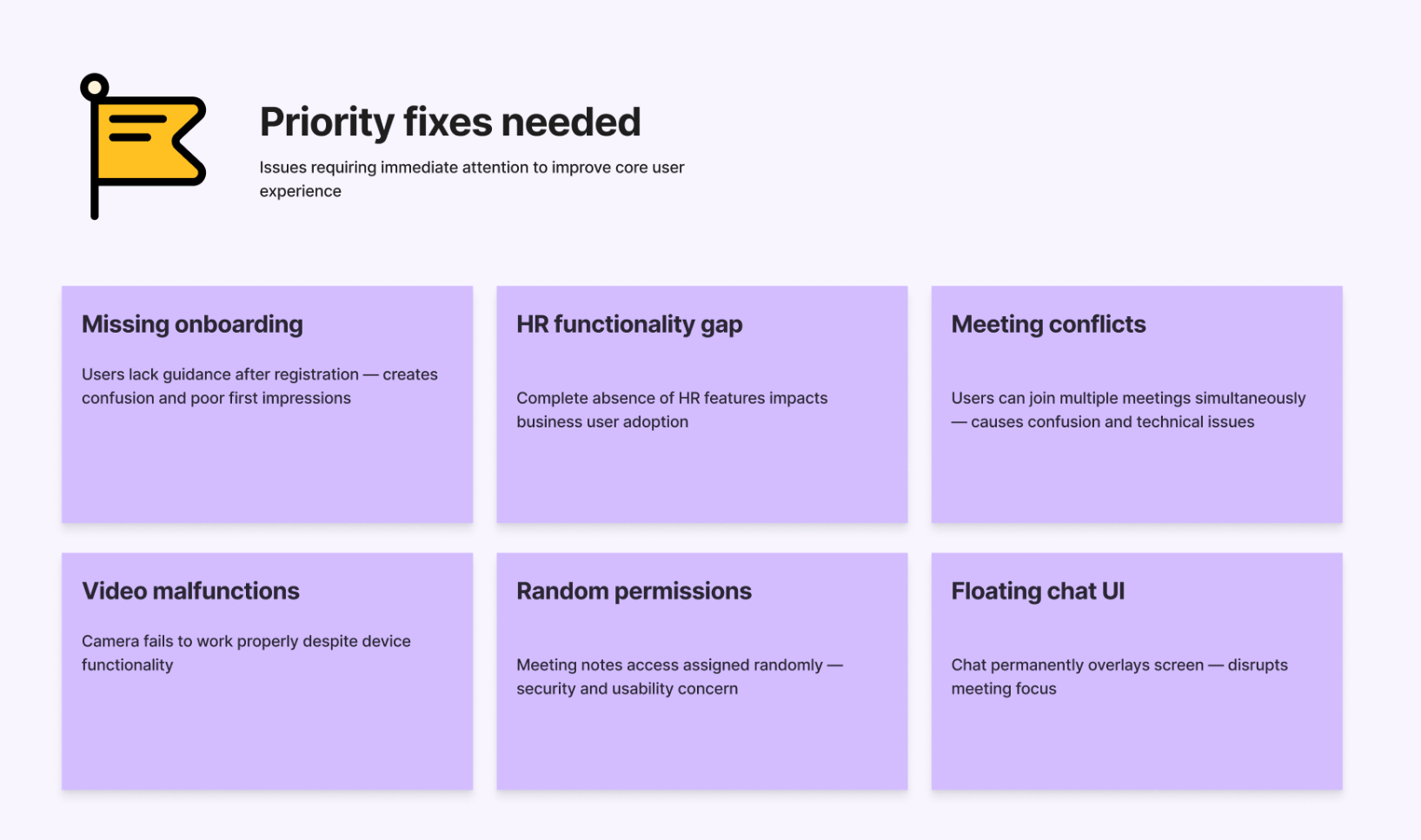
Experience journeys of both the user personas are evaluated with previous app and desired app features using stakeholder interview methodology.

Visual Designs
We crafted a cleaner and more contemporary visual language for Qik Office to reflect its positioning as an AI office app built around organized work, smart meetings, collaboration, and enterprise productivity. The design direction focused on making a feature-rich ecosystem feel more structured, approachable, and premium across both the website and product experience.
Once the targets were defined, the time had come to
06
The outcome we obtained
We were pleased to help shape a project that will shape the lives of several artists in the coming years. LILA's great interest in understanding its user's needs and the insights we gathered through our research certainly aided to shape the website and its marketing strategies. They understood the reasoning behind each design decision and conveyed their vision and market knowledge to the discussion, resulting in a fruitful strategic partnership.


